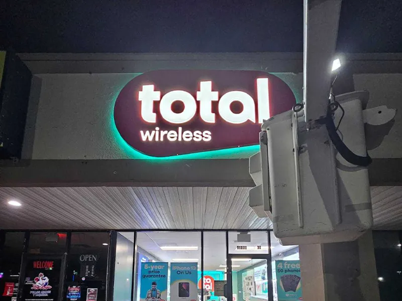
When it comes to signage, there are a lot of things to consider. One of the most important decisions you will have to make is what font to use.
The right font can help your business in Houston, Texas achieve its branding and marketing goals, while the wrong one can confuse customers and hurt your image. So, how do you choose the best font for signage? In this blog post, we will walk you through the process.
What fonts are used for signs?
There are a variety of fonts that can be used for signage. Some of the most common ones include Helvetica, Arial, Futura, Bebas, Avenir, and Times New Roman. However, there are many other options available, so you should choose a font that best suits your business’s branding and marketing goals.
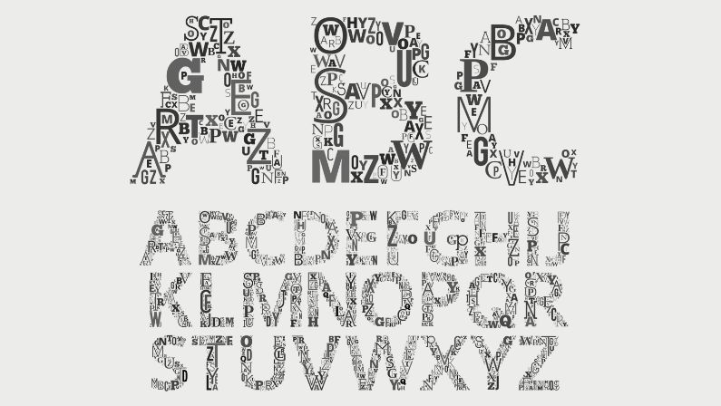
Different Font Categories
Serif Fonts
Sans-Serif Fonts
Sans-serif fonts are those that do not have small decorative lines at the end of each letter. They are considered more modern and streamlined than serif fonts and are often used in digital media. However, they can also be used for signage, and many businesses find that they work well for creating a contemporary look. Some popular sans-serif fonts include Arial, Helvetica, and Futura.
Script and Cursive Fonts
Script fonts are those that mimic the style of handwriting. They can be used to create a warm or intimate feeling for signage and are often used for wedding invitations or other personal events. While they can be used for signage, they should not be used in large doses or they can quickly become overwhelming. Some popular script fonts include Brush Script MT, Edwardian Script ITC, and Lobster.
Display Fonts
Display fonts are those that are meant to be used in smaller doses than other font types. They are often very flashy and decorative and are not meant to be used for lengthy pieces of text. However, they are perfect for adding some flair to signage and grabbing attention from customers. Some popular display fonts include Bebas Neue, Harabara Mais, and League Gothic.
Text Fonts
Text fonts are those that are meant to be used for long pieces of text. They are often very simple and easy to read, making them perfect for signage. Some popular text fonts include Verdana, Tahoma, and Lucida Sans Unicode.
Novelty Fonts
Factors for Choosing the Best Sign Lettering Font
Deciding which font to use is crucial. If you are a business owner in Texas, you can contact MSK Signs to help you choose the best font. There are a few factors to consider when choosing the best font for signage, including:
Readability
The font you choose should be easy to read, both for customers and for employees who might be reading it day in and day out. Serif fonts are often considered more readable than sans-serif fonts, but it’s important to choose a font that feels comfortable for your target audience.
Branding or Brand Guidelines
The font you choose should align with your business’s branding and marketing goals. If you’re going for a classic, professional look, a serif font might be the best choice. If you’re going for a more modern look, a sans-serif font might be better.
Style
The font you choose should fit the style of your signage. For example, if you’re using a traditional signpost, a serif font might look better than a sans-serif font. If you’re using a digital sign, however, a sans-serif font might look better.
Size
The size of the text should also be taken into consideration when choosing a font. If the text is too small, it will be difficult for customers to read. If the text is too large, it might overpower the signage and distract from its main message.
Context or Usage of Sign
The context or usage of the signage should also be taken into account when choosing a font. For example, if the signage is going to be seen in daylight, a light-colored font might be better than a dark-colored font. Or, if the signage is going to be seen at night, a dark-colored font might be better.
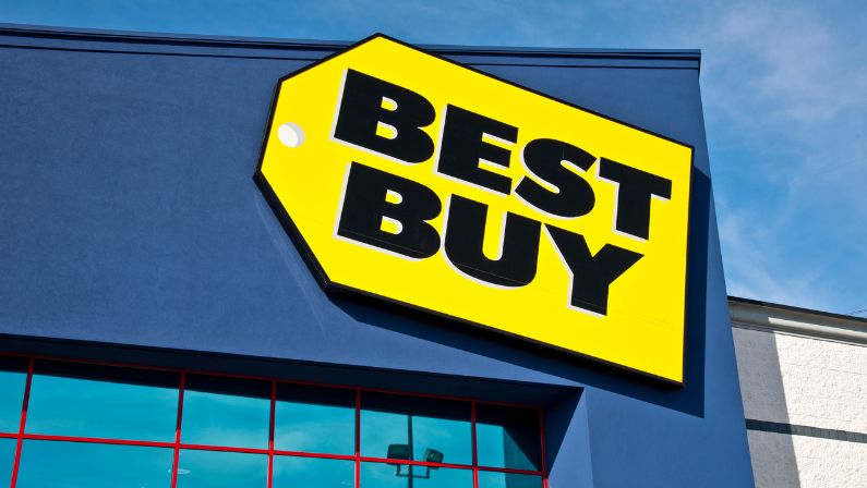
Best Fonts for Signs Outdoor
How do you choose the best fonts for signage when there are thousands of different font types available? Where do you look for the ideal font alternatives when it’s time to choose letters for your displays?
You might check out some of the top font resources online, like Adobe and Envato Elements, which offer a wide selection of fonts ideal for any sign and offer the following font examples:
Alchemist
Alchemist serif font is the best font for outdoor signs because it is easy to read, stylish, and multifaceted. It is a serif font, which makes it more readable than sans-serif fonts. It also has decorative lines at the end of each letter, which gives it a stylish look that is perfect for signage. Additionally, Alchemist is versatile enough to be used in a variety of contexts, making it the ideal choice for businesses that want a professional and stylish look for their signage.
Etna
This enticing typeface is available from a number of sources and is guaranteed to draw attention to any sign. The unique typeface Etna sans serif was created for optimal accuracy and aesthetics for large signage and exhibitions.
Classic Comic
Even though some sources will argue that comic fonts aren’t the best choice for signage, the Classic Comic sans serif font provides a compelling alternative to more conventional sign typefaces. The Classic Comic is designed to stand out to readers far away because its lettering is darker than that of most contemporary comic fonts.
Raidland
The Raidland brush script font is an exception to the general rule that script fonts don’t make the greatest fonts for signs. The font’s straightforward design makes it suitable for logos and posters and can still be readable at a distance.
Request
The Request display font makes a strong statement to convey a clear message on large signs. The sans serif typeface stands out and draws attention in a number of styles by utilizing abstract characteristics.
Tahoe Font
The Tahoe typeface has sans-serif lettering that is ideal for huge text like logos, headlines, and large signage, making it another distinctive display font. The font, which comes in a range of spacing settings, works best for large presentations and on the web.
Futura PT Font
The well-known Futura PT typeface is only one of many Adobe fonts that are ideal for large-format signs. Due to its clarity and legibility, the geometric sans-serif typeface has been used for almost a century and is still frequently used for signs.
Visia Pro Font
In need of a typeface for signs that stand out against light backgrounds? The font selection for signage designs can definitely be influenced by knowing how the display is made up as a whole. The Visia Pro typeface offers sharp and clear letters that will convey the intended message.
Myriad Pro Font
One of the greatest fonts for signs and a favorite among display fonts is Myriad Pro. It is actually so popular that this is the font Apple uses for many of its displays, including some well-known logos. It is also suitable for both headlines and smaller print.
Bebas Neue Pro Font
The Bebas font family’s typefaces are still a preferred option for signs due to their plain simplicity. With the introduction of the Bebas Neue Pro fonts, it is now available in lowercase, italicized, and cyrillic versions.
San Marino Urban Font
The popular San Marino font is a member of the urban typeface family. It fulfills all the requirements in terms of sign typefaces. San Marino is a bold, legible, contemporary font that is well-readable at any distance.
LTC Bodoni 175 Font
The Bodoni font type is popular for both large and small format signs thanks to its seamless strokes and partial serif, adding emphasis while retaining clarity. Adobe features the LTC Bodoni 175 font as a modern version of these common sign fonts.
Proxima Nova Font
The Proxima Nova font, a traditional san-serif typeface, is regarded as one of the best web fonts available, making it a wonderful option for small business owners who want their website and signage to match.
ATF Garamond Font
Why is Garamond, despite being a serif, one of the best sign fonts? The Garamond typeface is frequently used to draw attention to minute sign details like labels and descriptions. For little details, the ATF Garamond typeface is effective.
Montserrat
The bold and lighter, more natural iterations of the Montserrat font both look incredible. When bolded, the thick framework might project a welcoming atmosphere for a cutting-edge business like a digital agency or coffee shop. It becomes a stylish and modern typeface in its lighter version, making it ideal for a boutique clothing store or a start-up company.
Clarendon
Clarendon, another significant font, has a robust, durable structure that greatly improves legibility. With British letters, Clarendon is a favorite for signage, posters, and other materials.
Monotype Corsiva
Consider choosing Monotype Corsiva if you want to give your sign a bit of style and beauty. Monotype Corsiva’s more generous kerning, or proportional spacing between characters, compared to many other Script types, makes it quite readable. The letters are easier for the eyes to distinguish because the strokes don’t frequently overlap.
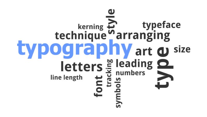
What Makes a Good Typeface Design?
Even Kerning
Even Kerning is when the spaces between the letters are equal. This is important because it makes the text look nicer and it’s easier to read.
Consistency
The character set of a well-designed typeface, which includes numerals, punctuation, and some symbols, should have a consistent design aesthetic.
Balance
An adequately spaced and designed typeface should have an even color and texture, especially in text designs where legibility is crucial. This is the end result of the aforementioned characteristics being successfully integrated. The overall coherence of grayness, or density, in a typeface is determined by its color and texture.
Legibility
Legibility is a term used to describe how easily characters, words, and the entire text can be read. Since text typefaces are designed for smaller sizes and longer text settings, it is particularly crucial for them. In most display faces, legibility is also a key consideration, unless the designer has other goals in mind that may take precedence over legibility.
Digital vs. Print Fonts
The fonts chosen for printed signage must be readable and bold enough to print with. This is because too-thin text might cause problems with some types of sign printing equipment. Using larger fonts will help to guarantee that your sign is legible, clear, and prints just as you intended.
Although digital fonts come in a range of sizes and still look sharp, thick fonts and text work best for a large, printed sign. But it’s also important to remember that not everything looks fantastic in both print and digital formats. Some fonts appear more attractive on a computer screen than they do when printed.
Best Fonts for Small Layout Signs
In general, large format signs are those that are intended to be viewed from a distance rather than picked up and viewed. The most important font family to keep in mind when creating a large format sign is sans serif.
Best Fonts for Large Format Signs
You can use either serif or sans serif fonts for small format signs, which include business cards, stickers, postcards, brochures, and door hangers among other signs.
Best Professional Fonts
To remain as professional as you can, use conventional and popular fonts. Business professionals ought to use Times New Roman, Arial, and Helvetica.
Fonts Can Make or Break Your Signage
There are a variety of fonts that can be used for signage, depending on the message you want to communicate and the size and format of the sign. We’ve looked at some of the best fonts for signage, both digital and print, and outlined tips for choosing the right typeface.
Whether you’re looking for a traditional or more modern font style, these recommendations will help your business create signs that are easy to read and look great. For expert advice on signage fonts, MSK Marketing Solution can assist you in choosing the right one.
